Benefits of Using Infographics in Your B2B Proposals
Social media has changed the way we read. We are used to seeing graphics and video for everything now, from a simple quote to how-to videos.

Why should responses to business proposals be any different?
Businesses often rely upon a formal bidding process to source goods and services from potential suppliers as a standard practice.
Proposals typically limit the number of pages to convey your message and sell yourself. The correct use of infographics in your proposal can not only bring your proposal to the next level, it can be the differentiating factor between winning new business or losing it to your competitor.
The statistics from an Unbounce article on why infographics make great marketing tools are compelling enough to dictate that any content planning your company is currently using for responses must involve visuals. Consider the following:
- Publishers who utilize infographics grow in traffic an average of 12% more than those that don’t.
- In just over two years, infographic Google search volumes increased over 800%.
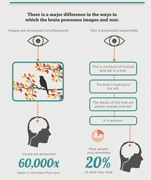
- Images are processed simultaneously while text is processed sequentially, therefore, visuals are processed 60,000x faster in the brain than text.
- 65% of the population are visual learners.
Information graphics, or infographics, are defined as a visual image, such as a chart or a diagram used to represent information or data. “The best informational graphics make data easy to understand,” said Pew Research Center’s Graphics Director Michael Keegan, who has overseen and designed news graphics at major news organizations for over 35 years. “Well-designed charts and diagrams are the shorthand to complex information that may otherwise go unread — or worse — be misunderstood. Getting to the heart of the matter — succinctly, accurately, and with a bit of flair — is the ultimate test of a graphic’s success.”
If done correctly, these graphic visual representations present the information quickly and clearly. In order to be considered an infographic, the graphic must:

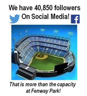
- Be Relevant — An infographic should never be put on a page where it is out of context or immaterial to the proposal. For infographics with just one single number to display, it is a good idea to enhance the impact through the use of metaphor to add context. By comparing a number to something else that is familiar, you can create understanding.
- Be Original — Canned presentations look obvious and desperate. Know your audience and prepare your artwork accordingly. A presentation for a local distributor of coffee beans will be very different from that to a large accounting firm. If you are using an existing infographic, make sure it is relevant and give credit to the originator.
Now that you have the basics for infographics down, consider how particularly useful they can be when responding to a B2B Request for Proposals (RFP).
There are no hard rules for how many infographics per page or pages, so make every effort to strike the right balance based on the message and the customer.
During content planning, it is easiest to write and then look for information to convert to graphics as it is easier to replace text with a graphic than the other way around.
- Proposals are very often page limited with font size restrictions, however, many times a requester will make exception for graphics allowing a smaller font size. These allowances will either be addressed in the original RFP or can be requested during the Q&A period. This allows the proposer to get more information into less space. Both tables and charts can be infographics and provide more information within much less space.
- An infographic may be able to fulfill a requirement where words fail. Specifically, a requirement for a work plan would be a requirement that not only benefits from an infographic, it would require a compelling argument to not be presented this way.
- Evaluators can get bleary-eyed reading what can be very dry material — a well-done infographic will break up boring text and add visual appeal to a page.
- An infographic allows the proposer to tell a story, allowing the reader to see the evolution of a process or complex idea rather than to read forward and have to look backward for previous steps. This can be an excellent method to describe B2B services.
- Promote brand awareness. While not intended for this, a company logo can be interwoven into almost any infographic, reinforcing your brand. Other potential logos for inclusion are those of your major subcontractors which can promote the image of a team supporting the requester rather than the proposer and a list of vendors.
Importantly, avoid the potential pitfalls to using infographics in your proposal.
- A rendering with no content or confusing content can be detrimental. If the graphic is not compelling or does not allow the viewer to take in more information in one look, remove it.
- The infographic does not support the written content. While it may be interesting, it is not relevant to the writing.
- The visual is not consistent with the style of the proposal. Just as a proposal for the U.S. Army would not utilize Navy Blue as its primary color, the overall look and feel of the proposal and its infographics should be tailored to the customer and content.
- Your graphics do not focus on your future client's wants and needs. Include graphics that help them choose you, otherwise, while this may be relevant to you or your business, you are providing information that is useless to the reader.
- Take the time to provide professional-looking artwork. A stick drawing of a chart will look sad and forced — while striving for simple and succinct, being overly minimalist will project your company as unprofessional. Strike the right balance.
There are many instruments that can be utilized to create infographics. Some of the more popular are Adobe Photoshop and the Microsoft suite of products including PowerPoint, Project, and Excel as well as websites with stock imagery. There are also many easy-to-use websites dedicated exclusively to creating infographics including: Venngage, Canva, Infogr.am, and Easel.ly.
Regardless of the tools used, it is helpful to follow these simple tips when designing your own infographic:
- Exclude descriptive words
- Use known acronyms
- Use a sans serif, narrow font for ease of reading
- Decrease line spacing to save space
- Use short arrowheads
- Eliminate unnecessary white space
Think of infographics as just another tool in your tool belt to help you achieve your goals of new and expanded business.
This article, Using Infographics in Your B2B Proposals, was originally published by B2B Writing Success.

The AWAI Method™ for Becoming a Skilled, In-Demand Copywriter
The AWAI Method™ combines the most up-to-date strategies, insights, and teaching methods with the tried-and-true copywriting fundamentals so you can take on ANY project — not just sales letters. Learn More »
Its a wonderful time with you today thanks
Guest (Kingsley ) –